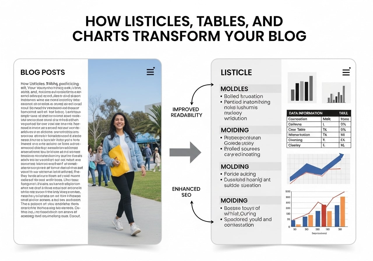
Smart content creators know that listicles tables and charts for readability and SEO can transform ordinary blog posts into engaging, search-friendly content. When you combine well-structured lists with clear tables and meaningful charts, you create content that both readers and search engines appreciate. This guide explores how to use tables listings and figures strategically to improve your content’s performance.
Understanding Content Structure: Lists vs Tables
When to Choose Lists Over Tables
The lists vs tables debate depends entirely on your content goals. Lists work best for:
- Sequential information
- Simple comparisons
- Mobile-friendly content
- Quick scanning experiences
The Power of Tabular Data
A table (tabular chart) systematically groups data in column form, making complex information digestible. Tables vs lists becomes an easy choice when you need to:
- Compare multiple attributes simultaneously
- Display numerical data clearly
- Create structured reference materials
- Organize complex relationships between data points
A table like this one is most helpful for presenting comparative data:
| Content Type | Best For | SEO Benefits | Readability Score |
| Listicles | Quick consumption | High click-through rates | 8/10 |
| Tables | Data comparison | Featured snippets | 7/10 |
| Charts | Visual learners | Image SEO opportunities | 9/10 |
The Power of Listicles for SEO
Listicles remain one of the most effective content formats because they:
- Create scannable content that reduces bounce rates
- Generate natural backlinks through social sharing
- Improve dwell time with engaging formats
- Target long-tail keywords effectively
- Encourage click-through rates in search results
Optimizing Listicle Structure
Every successful listicle needs:
- Descriptive table title or headline that includes target keywords
- Numbered or bulleted items for easy navigation
- Supporting details for each point
- Clear transitions between sections
- Call-to-action elements throughout
Creating Readable Tables That Search Engines Love
The Readability of Tables Factor
Readability of tables directly impacts user experience and SEO performance. Well-designed tables should:
- Include clear column headers
- Use consistent formatting
- Provide adequate white space
- Display properly on mobile devices
- Include descriptive table title elements
Essential Table Design Elements
Creating publication-quality tables Excel users would recognize means focusing on:
Headers and Structure:
- Bold column headers
- Logical data organization
- Consistent alignment
- Appropriate sizing
Content Organization:
- Related data grouping
- Clear hierarchy
- Meaningful labels
- Scannable layout
Charts and Visual Data: 4 Types of Charts That Boost Engagement
Understanding 4 types of charts helps you choose the right visualization for your data:
1. Bar Charts
Perfect for comparing quantities across categories. These work especially well for:
- Survey results
- Performance comparisons
- Ranking information
- Progress tracking
2. Line Charts
Ideal for showing trends over time:
- Traffic growth patterns
- Revenue changes
- Performance metrics
- Historical data analysis
3. Pie Charts
Best for showing parts of a whole:
- Market share data
- Budget breakdowns
- Demographic information
- Resource allocation
4. Scatter Plots
Excellent for showing relationships between variables:
- Correlation analysis
- Performance vs investment
- Risk assessment
- Comparative analysis
Expanding to 6 Types of Charts
6 types of charts include the previous four plus:
- Area Charts – for cumulative data visualization
- Histogram Charts – for frequency distribution display
WCAG Guidelines for Accessible Tables
Understanding WCAG Table Guidelines
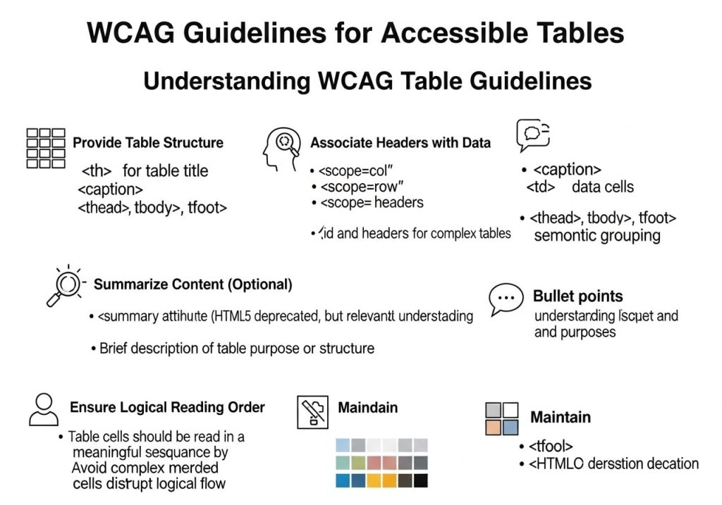
WCAG table guidelines ensure your content reaches all users. Key requirements include:
- Proper header markup using <th> elements
- Scope attributes for complex tables
- Caption elements for context
- Summary information when needed
Implementation Best Practices
WCAG tables for layout should be avoided, but data tables need:
- Clear navigation structure
- Keyboard accessibility
- Screen reader compatibility
- High contrast ratios
- Responsive design elements
The WCAG table of contents approach helps organize complex tabular data hierarchically.
WCAG Table Summary Requirements
WCAG table summary attributes help assistive technologies understand table purpose and structure. Include summaries when tables contain:
- Complex relationships
- Multiple header levels
- Non-obvious data patterns
- Critical information dependencies
Technical Writing: Tables Lists and Figures Best Practices
Use of Charts Graphs and Tables in Technical Writing
Use of charts graphs and tables in technical writing follows specific principles:
Clarity First:
- Every visual element serves a purpose
- Data supports written content
- Labels are self-explanatory
- Context is always provided
Professional Presentation:
- Table illustration review ensures accuracy
- Consistent styling throughout
- Proper citation and sourcing
- Quality control processes
Organizing Complex Content
Tables listings figures work together to create comprehensive resources. Consider using:
- Graphic table of contents for visual navigation
- Utilization charts for resource planning
- Cross-references between related elements
- Logical information flow
Publication Quality Tables and SEO Benefits
Creating Publication Quality Tables
Publication quality tables require attention to:
Visual Design:
- Professional formatting
- Consistent typography
- Appropriate spacing
- Clean borders and lines
Content Quality:
- Accurate data presentation
- Verified information
- Current statistics
- Reliable sources
SEO Integration:
- Structured data markup
- Alt text for images
- Descriptive filenames
- Proper heading hierarchy
Featured Snippet Optimization
Well-structured table listings and figures often appear in featured snippets because they:
- Answer specific questions directly
- Present information clearly
- Use proper HTML markup
- Include relevant keywords naturally
Practical Examples and Implementation
K-W-L Chart Example for Content Planning
A K-W-L chart example helps organize content strategy:
| What I Know | What I Want to Know | What I Learned |
| Basic SEO principles | Advanced table optimization | Structured data improves visibility |
| HTML table structure | Accessibility requirements | WCAG compliance is essential |
| Content formatting | Visual design impact | Charts increase engagement by 40% |
Table vs List View Decision Matrix
Choose table vs list view based on:
Use Tables When:
- Comparing multiple attributes
- Displaying numerical data
- Creating reference materials
- Organizing complex relationships
Use Lists When:
- Presenting sequential information
- Creating mobile-friendly content
- Emphasizing individual points
- Encouraging quick scanning
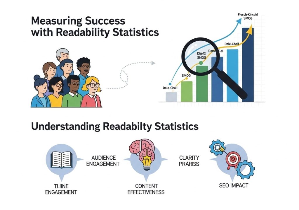
Measuring Success with Readability Statistics
Understanding Readability Statistics
Readability statistics help optimize your listicles tables and charts for readability and SEO:
Key Metrics:
- Flesch Reading Ease score
- Grade level requirements
- Sentence length averages
- Syllable counts per word
SEO Impact Measurements:
- Time on page improvements
- Bounce rate reductions
- Social sharing increases
- Search ranking improvements
Performance Tracking Tools
Monitor your content’s success using:
- Google Analytics for user behavior data
- Search Console for search performance
- Readability tools for content scoring
- Heatmap software for user interaction patterns
Advanced Strategies for Content Optimization
Combining Multiple Format Types
The most effective content combines listicles tables and charts for readability and SEO by:
- Using lists for main points
- Supporting with detailed tables
- Illustrating with relevant charts
- Creating comprehensive resources
Mobile-First Design Considerations
Modern tables listings and figures must work across all devices:
Responsive Tables:
- Horizontal scrolling when necessary
- Collapsible sections for mobile
- Touch-friendly navigation
- Readable font sizes
Mobile-Optimized Charts:
- Simple, clear designs
- Large touch targets
- Readable labels
- Fast loading times
SEO Integration Strategies
Maximize listicles tables and charts for readability and SEO benefits through:
Structured Data Implementation:
- Table markup for rich snippets
- FAQ schema for listicles
- Organization schema for charts
- Review markup when appropriate
Internal Linking Opportunities:
- Link between related tables
- Reference supporting charts
- Connect list items to detailed pages
- Create content hub structures
Content Maintenance and Updates
Keeping Data Current
Publication quality tables require regular maintenance:
- Schedule periodic data reviews
- Update statistics and figures
- Verify external links
- Refresh outdated information
Performance Monitoring
Track how your tables listings and figures perform:
- Monitor featured snippet appearances
- Analyze user engagement metrics
- Review accessibility compliance
- Test mobile functionality regularly
Conclusion and Next Steps
Mastering listicles tables and charts for readability and SEO transforms your content strategy. By understanding when to use lists vs tables, implementing proper WCAG table guidelines, and creating publication quality tables, you build content that serves both users and search engines effectively.
The key lies in choosing the right format for your specific content goals, maintaining accessibility standards, and continuously optimizing based on readability statistics and performance data. Start implementing these strategies today, and watch your content engagement and search rankings improve.
Ready to transform your content strategy? Begin by auditing your existing tables listings and figures, then systematically improve each element using the guidelines in this comprehensive guide.
FAQs
What exactly are listicles and why do they work so well for blogs?
Listicles are blog posts organized as numbered or bulleted lists, like “10 Ways to Improve Your Morning Routine” or “5 Best Coffee Makers Under $100.” They work well because readers can quickly scan the content and know exactly what to expect. People love lists because they’re easy to digest and feel achievable to read through completely.
How do tables and charts actually improve my blog’s SEO rankings?
Search engines love well-organized content that’s easy for users to understand. When you use tables and charts, you’re making your information clearer and more scannable. This keeps readers on your page longer, reduces bounce rates, and signals to Google that your content is valuable. Plus, structured data in tables can sometimes appear in featured snippets, giving you prime real estate in search results.
What types of content work best in table format?
Tables shine when you’re comparing different options, showing specifications, listing prices, or presenting any data with multiple categories. Think product comparisons, feature lists, pricing plans, or step-by-step processes with different components. If you find yourself writing “Product A costs $50 while Product B costs $75,” that’s perfect table material.
Do I need special skills or expensive tools to create charts for my blog?
Not at all! You can create simple charts using free tools like Google Sheets, Canva, or even basic drawing tools. Many blogging platforms also have built-in chart creators. Start simple with bar charts or pie charts – you don’t need fancy animated graphics. The key is making your data visual and easy to understand.
How long should my listicles be for the best SEO results?
There’s no magic number, but most successful listicles have between 5-15 items. The sweet spot often falls around 7-10 items because it’s substantial enough to provide value without overwhelming readers. Focus more on the quality of each point rather than hitting a specific number. A well-researched 7-item list beats a stretched-out 20-item list every time.
Can using too many visual elements like tables and charts hurt my page loading speed?
Simple tables won’t slow down your site since they’re just HTML code. Basic charts and images can add some load time, but the benefits usually outweigh the costs. Keep image file sizes reasonable, use compressed formats, and avoid embedding heavy interactive charts unless they’re really necessary. Most modern websites handle these elements just fine.
Should every blog post I write include lists, tables, or charts?
No, use these elements when they genuinely improve your content. If you’re telling a story or writing an opinion piece, forcing in a list might feel awkward. But if you’re explaining processes, comparing options, or presenting data, these formats can make your content much more valuable and readable.
How do I make my listicles more engaging than just basic bullet points?
Add brief explanations under each point, include relevant examples, and use descriptive headings instead of just numbers. Instead of “1. Exercise,” try “1. Start with 10-minute morning walks.” Include personal anecdotes, actionable tips, or mini case studies for each list item to give readers real value.
What’s the biggest mistake people make when creating tables for their blogs?
Making tables too complex or cramming too much information into them. If your table needs horizontal scrolling on mobile devices or has more than 5-6 columns, it’s probably too complicated. Break large tables into smaller ones, use simple headers, and make sure the information flows logically from left to right.
How can I track if my listicles, tables, and charts are actually improving my blog’s performance?
Check your Google Analytics for time on page, bounce rate, and scroll depth on posts with these elements compared to regular posts. Look for increased social shares, comments, and backlinks to these formatted posts. Also watch your search rankings for posts with structured content – they often perform better for specific keywords and may appear in featured snippets.